This webpage contains affiliate links. We may earn commissions for purchases made through affiliate links in this webpage. For more information, please read our Affiliate Disclaimer Policy.
NEW REAL CANADIAN SUPERSTORE CAMPAIGN FOCUSES ON REAL CANADIAN FOOD, PEOPLE AND LIFE.
Today, Real Canadian Superstore is launching a new campaign and brand design that focuses on who we are as Canadians. Everything from the foods from each other's cultures that we love, to our unique and diverse identities, and even what’s in our shopping carts.
The goal of the campaign, in development by Vancouver’s One Twenty Three West since October 2020, is to create a true reflection of who we are both individually and collectively and reinforce Real Canadian Superstore as a place where foods from all cultures can be found, and all people are welcome.
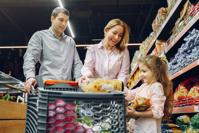

The campaign includes real Canadians who shop at Real Canadian Superstore as well as real team members who work there.
Mia Thomsett, Creative Director at One Twenty Three West said “Canadian food has a reputation for being undefinable. But in a way, that’s what makes it unique: Canadian food is incredible because it’s so diverse.” and added “Superstore has such a huge diversity of product, there’s something for everyone. As a brand, they truly do represent everybody and this campaign puts a spotlight on that.”
The campaign launches today with a 60 second video on broadcast TV that celebrates how varied our national palette is and the cultures so many of the foods we love belong to. As a nation we’re maple syrup and bacon, but we’re also halo-halo and hot pot.

The campaign also includes two 30 second broadcast spots that highlight the diverse needs that can be found in every household, as well as how each individual’s needs are always changing.
All broadcast video has been versioned in English, Hindi, Cantonese, Mandarin and Tagalog and will run on multicultural media as well as traditional media.
In Vancouver, Calgary, Edmonton, Winnipeg and Ontario, the campaign continues with a major OOH takeover that showcases 10 real Canadians and what’s in their carts. It features a cross-section of Canadians of different ages, backgrounds, genders and abilities.

A diverse group of Canadians was also tapped for the production of the campaign, from photographers Wade Hudson and Vicky Lam to the bands that were featured in the commercials. The 60 second video features Stadium Pow Wow by Halluci Nation while the 30 second videos feature Toronto hip hop artist Charmaine and Toronto artist Tyson Kuteyi.
Shelley Tangney, Sr. Director, Brand Marketing and Strategy at Loblaw Companies Limited said “This platform and campaign is designed to be a permanent shift in how we go to market. It isn’t about a social trend or climate, but about recognizing and embracing something imperative; that representation matters. To ensure that no one is invisible, RCSS is focusing on a deeper level of customer centricity, a new and more relevant approach to celebrating food, and a more holistic representation of our offering.”
Tangney added “We were intentional in our inclusiveness in the making of the work, not just the end result that customers see on TV or social media. We made sure to have diversity, including BIPOC, LGBTQ2S+, Differently-abled and more, in the entire process from internal and agency creative directors to production crew, to photographers, artists, music, cultural advisors, and talent. Additionally, we built allyship action and donations into our brand purpose and strategic plan going forward.”
To ensure all work was culturally sensitive, many advisers were included in the process, from idea phase through production. Those include Lea Mackenzie, Principal at LNM Indigenous Consulting, former MP Dr Wilton Littlechild and multicultural Toronto agency Monsoon.

The development of the platform included an evolution of the brand's design system to be more modern, bold and energetic. The design work was led by Mooren (Mo) Bofill, 123w’s most recent equity partner.
On the design evolution, Bofill said “Design was integral to reimagining the RCSS brand experience. Evolving the Real Canadian Superstore visual language meant leveraging the heritage of the brand while modernizing it with a refined design that’s confident, simple and fun. Every design element was intentionally reimagined to better reflect RCSS.” and added “The new RCSS design language needed to signal a new, modern, digital-friendly brand that was big, bold, and playful. The design system needed to be a modular, flexible and inclusive canvas for every Canadian."